Saturday, 13 October 2012

Manhunter (case study)


After watching Manhunter i thought it was a great film. Originality and dramatisation keeps the viewer gripped. The sound, the camera angles and the narrative make this film really effective in what it tries to achieve. 
The first scene gets straight into a crime scenario, where you are directly in the killers perspective as he is going to commit a crime on his victim, a family. The scene then switches to a beautiful place where theres an ocean, white sand, and a sense of ambience surrounded in nature. It shows two men discussing something of an issue as they sit on a log.

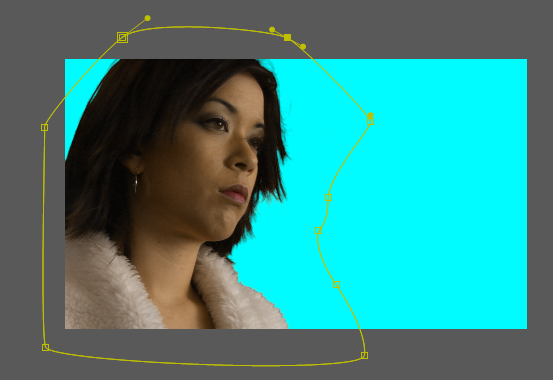
In this scene, Jack Crawford (top image) is asking Will Graham (bottom image) who is the protagonist, to take the case of the crime we just saw in the previous scene. The camera angles here keep switching views to look past either the back of the proposer or the chest of the protagonist. This style of recording shows theres resistance in the protagonist, whereas the proposer is trying to convince him to take the case. The camera angles throughout the film have a deeper definition, along with other factors. The camera itself is of huge importance when filming as it can convey what the characters are feeeling, it gives the viewer a sense of emotion which can only be seen through techniques of composition, camera angles or colour. 

Another two examples of the use of camera angles in this film are in the scenes where Will goes to visit Lecter and when Will has to relocate his family due to their safety.


When Will goes to visit Lecter, you can see there is a sense of confinement in Will, hence the shots which frame him within the prison. Framing within a shot usually gives the sense of restriction. In the prison scene, Will asks Lecter for any information but you can feel the hesitation in Will being dependent on Lecter, in doing so there is fear inside of Will, fear of his family's safety which causes him to run out of the prison cell before he leaks any more information which Lecter can use to his advantage. 
This same style of shooting appears later on, when Lecter finds out where his family live, so he has to relocate his family into a barren place, again this representing that his family are now confined due to safety issues. 

There is a constant reference to the architectural value of the city.
 The film has a contemporary and modern style to it especially during that era (1986). You can see this is in the scenes of the homes which exhibit modern furniture as well as the citys outlook.


As well as the urban references, there are also natural references...


The references to nature are something of precious moments. For example in the scene where the villain meets with the blind girl and he actually likes her, it seems as if he is a reformed person by the morning. You can feel the innocence in his being and at the same time the regret in his doings when he cried the night before. In the morning he wakes up to a peachy glow and finds the girl outside (top right shot). They both talk while the sun is rising and it seems as if he wants more of her affection by asking to see her again, the reference of nature suggests enlightenment and that there is an innocent side to him contrasted to his killer instinct.

Another notion of preciousness set by nature is the feeling of achievement. In the first scene Will Graham is living peacefully until someone asks him to take the case and this disrupts his way of life, away from his family, away from his home which is set in a natural surrounding. Once he accepts the case he is surrounded by the urban environment, and there is no getting away until he overcomes the problem/conflict. On numerous occasions he imagines the lifestyle he had before he took the case, it's almost like his home sick in the city. Then finally once he completes the case and kills the villain, he is rewarded with his old lifestyle back; the family, the house and the blissful environment. 


The use of colour in this film has more than just an appealing look, it's symbolism. One of the few colours which keep recurring is blue. Blue represents Will Graham and anything related to him, for example his wife or home. The blue used in many shots can represent calmness about him, as his character is quite collected and relaxed. Blue is a cool colour and you can see it exaggerated for emphasis in many scenes, such as the scene where he is in bed with his wife, the strength of the blue night fills the room with an eerie contrast, or the scene where he was handed bullets which have a blue cap, this was emphasized with a zoom on the bullets. Another recurring subject matter is the sky. There are many scenes shot with the sky in view perhaps this was a natural way to use the colour blue.


The other colour used frequently was green. Green represents the villain (Francis Dolarhyde) as well as any scenes relating to problems, which would also link back to the villain in a sense. The use of green represents sickness and alien, which is quite ironic as the villains house is endowered with images of space and the universe. It was mentioned Francis was influenced by the lunar patterns, so it tells the viewer that the villain has some form of passion for astronomy.


White was also used frequently throughout. All of the scenes in the mental hospital were purely white, this represents a state of purity and neutrality. The white has a sense of dementia in which one of the scenes Will runs away from, as if he is feeling claustrophobic mixed with fear. Another scene in which white is used is when Will visits the crime scene, the room is entirely white (pure) but covered in a red vibrant blood, the contrast here tells of a brutal relationship between the killer and the innocent family.


The use of purple and pink hues are in scenes of distress. For example in the scene where the idea of Wills wife is at the tether of being the killers next victim, in the blue haze of her house there is shot of the fish tank which is a pinky hue contrasted with the surrounded blue darkness. Or towards the end where Will finds the killer and kills him just in time to save the innocent blind woman, regardless of the burden which has been lifted there has been damage done and traumatisation of people, this is shown through the use of purple and pink hues on the clothing of the blind woman and the sky.


Other shots which i really liked:


I liked the first shot for the use of colours. The orange flame which burns a warm colour, filling up the set with a lava glow, this really appealed to my eye. With the evening shot i liked the composition and how the silhouette of the two speaking while the sun sets, it was effective in conveying something of a serious issue.

Another scene i really liked was when Francis took the sightless co-worker to see a tiger. As her only way of 'seeing' is to touch, she begins to caress the tiger, as this is happening Francis feels stimulated by this, almost as if he is being sexually aroused. This scene can represent the persona of Francis in the tiger. The tiger is sedated and can't bite as his aggressive nature usually is, at the same time this could reflect the feelings of Francis, the tiger being a reference to him and how he is not going to 'bite' the co-worker as he has fallen for her. We later discover he seems to like her and enjoys the affection, but all that is undone when he assumes she is cheating on him, to awake the killer again.


One of my favourite scenes are when he is in the plane and dreaming about whats its like to be with his wife again. Then it suddenly switches to shots of the crime scene's photographs, the use of juxtaposition is quite effective. From colourful pleasant shots, to a cut scene of images of dead bodies, with contrasted dark and dull tones.


Overall a great film and i really enjoyed it, the execution and style of recording was effective. Especially the use of colours to convey emotion and feeling. 

http://sensesofcinema.com/2007/cteq/manhunter/

Friday, 12 October 2012

Pre-practice


Andrew Kramers website (www.videocopilot.net) are a great source for tutorials, i took a look at some keying techniques to integrate live action footage successfully to a background plate. 
http://www.videocopilot.net/tutorial/basic_color_keying/ 

I also came across this great website which gave a few hints and tricks into motion tracking, and it also gave free green screened footage to play round with, which was perfect for me to learn on.
So i downloaded one of the greenscreen shots and thought id start with this shot:


 A few of the things that are going to be an an issue with this shot are:

- The green thats spills on her.
- The tracking markers in the back could be difficult to pick up (difficult to see in the video, but you can make out the shapes, they have a more lighter green tint)
- The thinner strands of her hair being blown about will be difficult to pick up.

Using Andrew Kramers tutorial as a reference, the best way to key out the footage was using 'keylight' in after effects. It is the most effective and suitable plugin in after effects. 

(click to enlarge)
But it wasn't just the matter of identifying the colour with a mere click and everything goes away. As you can see, the green spill which was on her jacket and face has also caused transparent areas on her which we will need to bring back by tweaking some of the settings. The best way to actually see the visibility of the keyed plate is by using the 'screen matte function'.


Screen matte (click to enlarge)
The screen matte makes it easier to identify the plates components.

White = The part we are keeping (100% opacity)
Black = The part which is going to be removed (0% opacity)

Anything in between (grey) will be any value between 1-99% depending on the grey. 

So in order for this to be most effective, we have to make sure all of the girl is white, and anything surrounding her is black. (the pole hanging by her with two notes attached are for tracking purposes and will be dealt with later, it does not matter if they stay in the shot at this stage, what is important is that all of the green is keyed out for now).

As you can see in the above matte screenshot there are greys on her, so we have to eliminate them and make sure they are all white so she is 100% opaque. There are also greys being caused by the lighter green tracking marks in the back which 'keylight' hasent picked up, as they are a much lighter green which we have to remove and make transparent. 

After tweaking some of the settings to increase the gain on black to remove some of the grey areas and tightening up the white, it resulted in a matte looking like this:


(click to enlarge)
Now it successfully had removed all of the grey areas and there was a clear definition between the lady and the background, in order to better see the results i placed a bright blue layer underneath to see how it relates to a background and this also helps pick up on any deficiencies.


The problem i had now was it was too defined, you can see the hair loses its naturality, and the edges are too sharp and rugged. 

So i had to find a balance which maintained the intricate details found on her, yet removed majority of the green in the back. So after tweaking some more, i managed to find a good balance but the problem was some of the tracking points in the back are still visible (the grey spots).


 Keylight wouldnt pick up on them so i decided to add another keying effect on top, called 'colour key' which removes a certain colour (similar to keylight, but less technical) which eliminated those tracking points completely to give me a clean plate.

Final result

 This is the clean plate, if you notice the parts which were originally transparent have now been filled to an accurate representation of colour which keylight helps achieve. i now had to remove the pole with the notes attached. It was a simple operation of rotoscoping it out, a basic mask was needed as i didnt need to be too accurate. I animated the mask path in accordance to the time of the clip to keep the pole out of the shot.


And voila, the footage is now ready for a new background. 

A summary of the stages:


To further develop this i decided to integrate her into a background. In order to do so i had to track the footage first, seeing as it wasn't a complicated shot i just used the 2D tracking plugin available in after effects. 


 The issue with this shot would be the fact that its a close shot. That would cause parallax problems and cause the background to look out of sync with the foreground, like the following result. 


So to overcome this rather, rather than tracking using the scale feature in after effects, I tracked just the position. The only usefulness of using scale would be to integrate something into the foreground.

After accomplishing the right track data, I had created a simple background, adjusted the lighting and did a colour correct to blend everything together. 

Here is the final:


Process:


Learning aims

[Learning aims]

(click to enlarge each image)


Tuesday, 2 October 2012

Video pitch + Top 5 + Case study

[Video pitch]


videpitc42h from M Hussain on Vimeo.


[5 inspirations]

 
I really enjoyed this short animation as it heavily consisted of visual effects and most of the techniques which i want to learn. I found the the narrative interestingly mysterious and the visual style really intrigued me.


This 3D short really inspired me for its use of 3D and narrative. Set in a beautiful futuristic, post apocalyptic world where nature has taken over along with some form of what seems like an alien force, which is after the destruction of humans. The cinematic effects are really effective and all the visual elements along with the plot work great together. An overall great short.

I wanted to show an environment in the game title 'Call of Duty 4: Modern Warfare'. This map specifically really fascinates me as i enjoy the feeling of coldness, quiteness and in general the atmosphere looming around this environment. It is set in Ukraine, and as any eastern european country i feel this map has captured the essence of that place. The gentle falling snow adds a great touch, especially in contrast to the surrounding war torn place. 


Dylan Cole is a matte painter. 
I find his work highly inspirational and is similar to what i wish to achieve. He creates awe-inspiring scenes using various methods, including working in 3D, raw painting and image manipulation which are used as mattes and backdrops, as well as creating concept art within the entertainment industry.

[Case study]

Expulsion. Moon and Firelight

I am going to analyse and critique this painting as a case study. 
This painting was made by Thomas Cole in 1828 during the romanticist period, which consists of paintings depicting nature at a high level of awe. This painting portrays the place of the biblical story of Adam and Eve when they were expelled from eden, note there are no characters present, it is just a visual representation of the environment.

There is a strong sense of drama in this painting, especially with the contrast in colours and strong lighting. The composition is quite daunting, with the bigger rock towering over the whole scene, and filled with a fiery glow as if its representing hell in a sense. The foreground has unusual shaped dead trees, a silhouette emerging closer towards the viewer bringing the person in. While in the midground lies the focus point of the bridge and the rock fuelled with fire. In the background there is a waterfall which lies heavily in contrast with the elements in the front, as they are warm colours of bright oranges and glowing yellows, whereas the waterfall in the back gives a sense of cool water running abunduntantly into a valley.

Surrounding the painting are seperate entities altogether. A glimpse on the right represents heaven. A sense of harmony and tranquility are shown through the use of colours, warm yellows gently merging into the soft lavender sky which suggest sunrise. The mountains filled with fertile green land which are also vast as they dissappear into the haze of atmospherical perspective. 

A glimpse on the left of the painting shows a distance sunset across an ocean.This could represent earth in this scenario. There is a sense of relation between both sides, a sun rising in Heaven on the right and the sun setting on earth to the left. This could represent that Adam and eve are going to be left in the night of the earth as the sun sets, when they could have had the lightness of Heaven. 

Saturday, 21 April 2012

Pre-production specialist study


1920 x1080


Scene 1:
-Lighter spark/flame
-Cigarette glow/flame


Scene 3:
-Bubbles particles
-Inky body


Scene4:
-Glass breaking/smoke


Sparking Wire


Pouring Liquid


-----------------------------------------------------------------------------------------


Caslon


Storyboard 9: American declaration of independence


Saturday, 4 February 2012

Live Brief (Custard Factory)


[PLANNING]


This was one of the early tests we made. As custard factory were still making the brief,  me and riz had time to play around with ideas. This idea was later scrapped.

A lot of our research on the custard factory came from the previous project, you can see that here.

[INSPIRATION]


I really liked the music video 'supernova' and this video gave an idea of how it was composed together. At this point i was inspired by compositing and visual effects, and i really wanted to incorporate compositing into the animation brief provided by the custard factory. It had a contemporary feel which i really felt the custard factory has. 


I found this video inspirational as it looked like various elements composited along with visual effects. The thing that inspired me the most was the lighting, i found it intriguing the way the lighting falls behind the black organic object and the overall mood perceived just by the lighting.


Along with the videos, images of 3d typography inspired me. The animation we made for the digital landscape project was using kinetic typography in 2D, i wanted to go a step further and use 3d elements for the introduction and ending.


Image concept


I looked at different fonts on dafont.com, and as the font is the main visual element we are going to use in our animation it has to be a suitable one. I found two fonts which i thought are quite suitable for the custard factory, as the typography had to be consistent and minimal i chose two similar looking ones.


I started of with an image concept which would give me a better idea on how it could look. I used maya to create the text in 3d which was quite simple using nurbs. 
I added a simple material with a light tone on the text and rendered out the colour and z-depth to give a more realistic feel. The render took over a minute which was a worry and gave me an idea how long it would take for a whole animation sequence!

I later composed the image into photoshop. I moved the zdepth into the channels section and applied a lens blur to the zdepth layer as a channel, this gave me control of how much to blur the layer. I then applied some dust effects using brushes and added a lighting flare, along with colour correction. I was quite happy with the outcome of the image and it gave me more of an idea on how the intro animation could potentially look.


Through communication with the client, we received the alphabet of the custard factory logo, but it seemed to have a problem as each time you select the individual alphabet, rings appear around it and it seems to be made up in segments. I am sure its not supposed to be in segments, but we have to work around this as its the only file the custard factory have of the actual logo lettering.


[TESTS]


This was an initial test which gave me an idea of how to use optical flares. The animation is a bit boring and dull, but it gave me a better understanding on how to use light and camera angles to achieve the look i want.


This was a test sequence to show the client the idea which i wanted to portray for the intro, i was planning on compositing it later into after effects to continue developing my idea. It took over 4 hours to render in maya (mental ray)! The only problem i had with this, is the camera angles were not planned as well, but it was just a test and i would have taken more time to plan the camera angles on the final.


As i knew what i wanted for the intro and the ending i had to come up with something to focus on the main themes of the three videos (retail,office space and events). I wanted it to have a grungey feel, yet still maintain that neon glow style which i feel custard factory suits. I came up with the idea of throwing paint onto the screen while different words came up which would keep the viewer engaged. I found it was quite an exciting approach and felt it could have been a successful idea if developed more.


A colour variation of the above animation.

With my animation rendered i was ready to composite the various elements into after effects. This image shows the kind of thing i wanted for the intro. Where little banners appear with the general information about custard factory.


As i was going to add elements into my scene i had to be able to have tracking data so that my little banners will stay true in 3d space. My initial thought was to bring the footage into a tracking program such as pfhoe. But that had problems as the tracking data kept getting lost, which im assuming is down to the camera movement. 


After doing a bit of research i realised i could use maya and after effects integration. I could copy the camera data along with null objects in maya and import them into after effects. So i placed a few null objects in my 3d scene in maya to use as tracking points for the little banners and exported the data into after effects. I felt this approach is much stronger than using tracking programs, as this is a much more accurate result coming directally from the program which created the camera movements.


After compositing successfully i had my animation ready for the final touchups, such as the optical flares. At this point i had to show the client the kind of style i had in mind and i never had enough time to finish the test, hence why the beginning has the lighting and towards the end its plain. I also would have liked to add dust particles floating in the air.

There are a few problems with this animation. One being the frame rate, because i was going to slow parts down in after effects so that there is more time to read the little banners I didnt realise the frame rate was on 24, and because of this, the parts where i have slowed down heavily appear to be jumpy. I should have used a higher frame rate in maya when recording the camera movement, or i should have created the correct movement of the camera in maya before rendering. Because i didnt have enough time i had to go with the initial rendering which wasn't planned. But ready or not my version of the intro had to be shown to the client.


In order to animate the ending in 3D i wanted the motion of the camera to be smooth in maya so i attached the camera to the nurbs circle, making it easy to rotate along the curve.


Due to little time i had to create an animatic to show the client what i had in mind for the ending. Rendering the animation would have taken too long.


  As mentioned before the file provided by the client was a bit messed up, so i had to recreate the logo in illustrator to the best of my abilities. I then exported the illustrator paths into maya, ready to turn into 3D typography.


I rendered one frame to give an example of the kind of 3D style i will incoporate into the ending, so the client can visualise how it would look in 3D.


[PRODUCTION]

At this point me and riz both met up with the client to show what we have made. The client gave us an insight into what worked well and what didn't. With the work i produced i was told that it was good but it was 'too dark' for the custard factory aswell as the fact that its 3D, the client preferred the 2D element of kinetic typography. Most of my work consists of lights and neon's i really wanted to emphasize that, hence why it was dark. In the end rizwans work was preferred as his work was white with a lot of vibrancy in different colours which i tend to stay away from. But from that meeting we knew where we were heading. The client also changed the brief a little, with the ending being the new intro and some of the wording changed. I think another reason why his work got chosen was because he worked on the main theme, whereas i worked on the intro and ending more, and im guessing the client was more interested in the main theme rather than the intro/ending.


For the main video the client wanted to use the 'history' part from the original video, but the aim was to get the message across without voice, so this initial test uses kinetic typography to tell the viewer about the history of the custard factory. I'm not happy with it purely because the text reading 'with a girl who was...' is too long.


The whole 3D was out of the scene, back to 2D typography! A test done in white for the new intro. Inspired by the original animation, but improved.


And a colour version..


Variance in typography boldness. I feel its too strong, but its upto the client once they see it.


This history test was much better than the other one, i feel it throws the message across more efficiently. Only thing i was noted on to change was the word 'girl' to 'woman'
------

At this point we are continuing to work on the project even though our deadline for university has expired. A bit of a mix up caused confusion to us, as we thought our deadline had been pushed to a later date, but in fact it never. So the work we are producing from now on is only for the sake of the custard factory.

I will continue posting once we complete the project next week, with the final animation, along with my final thoughts.