
[PLANNING]

This was one of the early tests we made. As custard factory were still making the brief, me and riz had time to play around with ideas. This idea was later scrapped.
A lot of our research on the custard factory came from the previous project, you can see that here.
[INSPIRATION]
I really liked the music video 'supernova' and this video gave an idea of how it was composed together. At this point i was inspired by compositing and visual effects, and i really wanted to incorporate compositing into the animation brief provided by the custard factory. It had a contemporary feel which i really felt the custard factory has.
I found this video inspirational as it looked like various elements composited along with visual effects. The thing that inspired me the most was the lighting, i found it intriguing the way the lighting falls behind the black organic object and the overall mood perceived just by the lighting.


Along with the videos, images of 3d typography inspired me. The animation we made for the digital landscape project was using kinetic typography in 2D, i wanted to go a step further and use 3d elements for the introduction and ending.

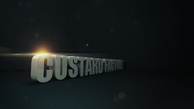
I started of with an image concept which would give me a better idea on how it could look. I used maya to create the text in 3d which was quite simple using nurbs.
A lot of our research on the custard factory came from the previous project, you can see that here.
[INSPIRATION]
I really liked the music video 'supernova' and this video gave an idea of how it was composed together. At this point i was inspired by compositing and visual effects, and i really wanted to incorporate compositing into the animation brief provided by the custard factory. It had a contemporary feel which i really felt the custard factory has.
I found this video inspirational as it looked like various elements composited along with visual effects. The thing that inspired me the most was the lighting, i found it intriguing the way the lighting falls behind the black organic object and the overall mood perceived just by the lighting.


Along with the videos, images of 3d typography inspired me. The animation we made for the digital landscape project was using kinetic typography in 2D, i wanted to go a step further and use 3d elements for the introduction and ending.
Image concept


I looked at different fonts on dafont.com, and as the font is the main visual element we are going to use in our animation it has to be a suitable one. I found two fonts which i thought are quite suitable for the custard factory, as the typography had to be consistent and minimal i chose two similar looking ones.


I looked at different fonts on dafont.com, and as the font is the main visual element we are going to use in our animation it has to be a suitable one. I found two fonts which i thought are quite suitable for the custard factory, as the typography had to be consistent and minimal i chose two similar looking ones.


I started of with an image concept which would give me a better idea on how it could look. I used maya to create the text in 3d which was quite simple using nurbs.
I added a simple material with a light tone on the text and rendered out the colour and z-depth to give a more realistic feel. The render took over a minute which was a worry and gave me an idea how long it would take for a whole animation sequence!
I later composed the image into photoshop. I moved the zdepth into the channels section and applied a lens blur to the zdepth layer as a channel, this gave me control of how much to blur the layer. I then applied some dust effects using brushes and added a lighting flare, along with colour correction. I was quite happy with the outcome of the image and it gave me more of an idea on how the intro animation could potentially look.

[TESTS]
This was an initial test which gave me an idea of how to use optical flares. The animation is a bit boring and dull, but it gave me a better understanding on how to use light and camera angles to achieve the look i want.
This was an initial test which gave me an idea of how to use optical flares. The animation is a bit boring and dull, but it gave me a better understanding on how to use light and camera angles to achieve the look i want.
This was a test sequence to show the client the idea which i wanted to portray for the intro, i was planning on compositing it later into after effects to continue developing my idea. It took over 4 hours to render in maya (mental ray)! The only problem i had with this, is the camera angles were not planned as well, but it was just a test and i would have taken more time to plan the camera angles on the final.
As i knew what i wanted for the intro and the ending i had to come up with something to focus on the main themes of the three videos (retail,office space and events). I wanted it to have a grungey feel, yet still maintain that neon glow style which i feel custard factory suits. I came up with the idea of throwing paint onto the screen while different words came up which would keep the viewer engaged. I found it was quite an exciting approach and felt it could have been a successful idea if developed more.


With my animation rendered i was ready to composite the various elements into after effects. This image shows the kind of thing i wanted for the intro. Where little banners appear with the general information about custard factory.

As i was going to add elements into my scene i had to be able to have tracking data so that my little banners will stay true in 3d space. My initial thought was to bring the footage into a tracking program such as pfhoe. But that had problems as the tracking data kept getting lost, which im assuming is down to the camera movement.

After doing a bit of research i realised i could use maya and after effects integration. I could copy the camera data along with null objects in maya and import them into after effects. So i placed a few null objects in my 3d scene in maya to use as tracking points for the little banners and exported the data into after effects. I felt this approach is much stronger than using tracking programs, as this is a much more accurate result coming directally from the program which created the camera movements.
After compositing successfully i had my animation ready for the final touchups, such as the optical flares. At this point i had to show the client the kind of style i had in mind and i never had enough time to finish the test, hence why the beginning has the lighting and towards the end its plain. I also would have liked to add dust particles floating in the air.
There are a few problems with this animation. One being the frame rate, because i was going to slow parts down in after effects so that there is more time to read the little banners I didnt realise the frame rate was on 24, and because of this, the parts where i have slowed down heavily appear to be jumpy. I should have used a higher frame rate in maya when recording the camera movement, or i should have created the correct movement of the camera in maya before rendering. Because i didnt have enough time i had to go with the initial rendering which wasn't planned. But ready or not my version of the intro had to be shown to the client.
There are a few problems with this animation. One being the frame rate, because i was going to slow parts down in after effects so that there is more time to read the little banners I didnt realise the frame rate was on 24, and because of this, the parts where i have slowed down heavily appear to be jumpy. I should have used a higher frame rate in maya when recording the camera movement, or i should have created the correct movement of the camera in maya before rendering. Because i didnt have enough time i had to go with the initial rendering which wasn't planned. But ready or not my version of the intro had to be shown to the client.

In order to animate the ending in 3D i wanted the motion of the camera to be smooth in maya so i attached the camera to the nurbs circle, making it easy to rotate along the curve.
Due to little time i had to create an animatic to show the client what i had in mind for the ending. Rendering the animation would have taken too long.


I rendered one frame to give an example of the kind of 3D style i will incoporate into the ending, so the client can visualise how it would look in 3D.
[PRODUCTION]
At this point me and riz both met up with the client to show what we have made. The client gave us an insight into what worked well and what didn't. With the work i produced i was told that it was good but it was 'too dark' for the custard factory aswell as the fact that its 3D, the client preferred the 2D element of kinetic typography. Most of my work consists of lights and neon's i really wanted to emphasize that, hence why it was dark. In the end rizwans work was preferred as his work was white with a lot of vibrancy in different colours which i tend to stay away from. But from that meeting we knew where we were heading. The client also changed the brief a little, with the ending being the new intro and some of the wording changed. I think another reason why his work got chosen was because he worked on the main theme, whereas i worked on the intro and ending more, and im guessing the client was more interested in the main theme rather than the intro/ending.
For the main video the client wanted to use the 'history' part from the original video, but the aim was to get the message across without voice, so this initial test uses kinetic typography to tell the viewer about the history of the custard factory. I'm not happy with it purely because the text reading 'with a girl who was...' is too long.
The whole 3D was out of the scene, back to 2D typography! A test done in white for the new intro. Inspired by the original animation, but improved.
And a colour version..


Variance in typography boldness. I feel its too strong, but its upto the client once they see it.
This history test was much better than the other one, i feel it throws the message across more efficiently. Only thing i was noted on to change was the word 'girl' to 'woman'
------At this point we are continuing to work on the project even though our deadline for university has expired. A bit of a mix up caused confusion to us, as we thought our deadline had been pushed to a later date, but in fact it never. So the work we are producing from now on is only for the sake of the custard factory.
I will continue posting once we complete the project next week, with the final animation, along with my final thoughts.
No comments:
Post a Comment